Editor
After installation, you can access the configuration editor by visiting the normal pendant
URL, mounted by cncjs, and adding /editor.html to the URL.
Example: http://my-raspberry-pi.local:8000/grid/editor.html
Settings

If you have not already, it’s best to configure your cncjs connection first, since this allows the editor to show the state of cncjs during use.
Connection settings
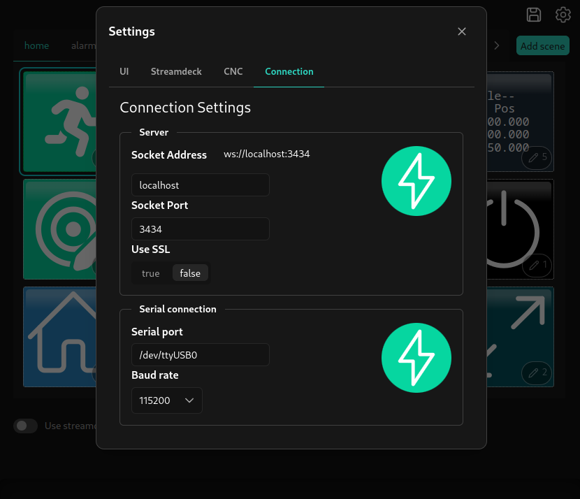
The socket address and port should point to your cncjs server.
The serial port and baud rate refer to the connection from cncjs to your CNC controller.
CNC settings
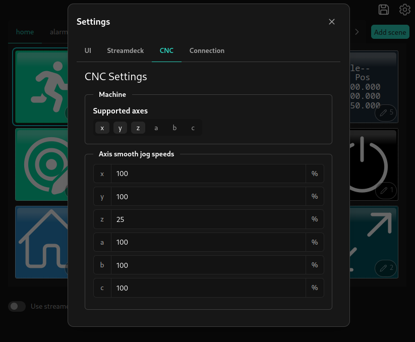
In the CNC settings section, you can enable or disable the axes your CNC supports, change the relative smoothjog speeds for specific axes.
UI settings
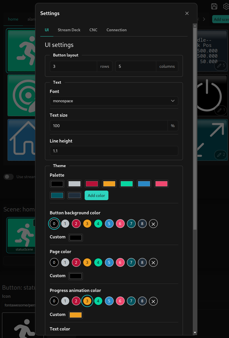
In the UI settings, you can change the color palette (which lets you maintain consistent colors in your buttons that can all be updated together), and other general colors, as well as the font and dimension settings.
If you’d like to use different settings for the web-based pendant and a physical stream deck, most of these settings can be overridden just for the stream deck from the Stream Deck tab. These settings include a checkbox to enable or disable overriding the default settings from the UI tab.
Layout editor
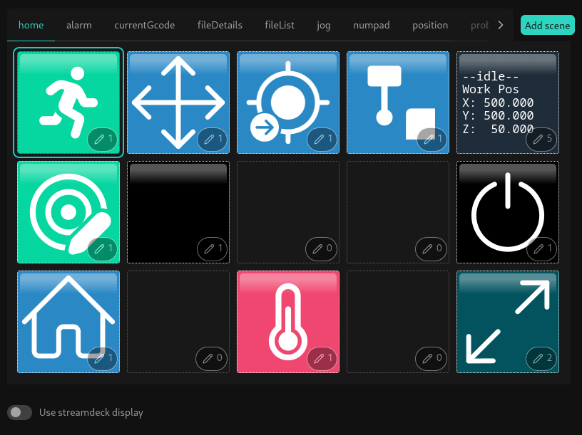
The home scene
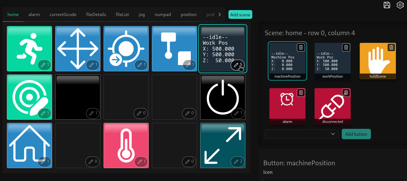
The scene list is the list of tabs at the top of the layout view. A scene is a named page containing buttons.
Each space in the scene can contain one or more buttons. The button’s visibility settings will control which of these buttons is visible at any given time, allowing buttons to appear to change based on current state or user input (for example, hiding or showing a button when GRBL is in an error state).
Most scenes can be renamed or deleted by right clicking on them in the scene list. New scenes can be added by clicking
the Add scene button and providing a name for the new scene.
The Use stream deck display toggle will emulate a streamdeck for the purposes of button conditions (see button editor
section below)
Editing a button
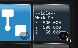
You can select a location to edit by clicking the edit icon in the corner of each space. The number next to the icon indicates how many buttons are being used at that location.
The button list
After clicking the edit button, the button list will be updated to show all of the currently configured buttons for that location. The order of these buttons does not matter, as only one can be displayed at a time.
A button has a unique name and can be displayed in multiple spaces or scenes. It has an appearance based on the selected icon, custom text, text alignment and color. It can be configured to be hidden, or disabled based on state, and can have behavior when the button is pressed down, released, or pressed and held (or a combination of these).
You can add a new button at this location by selecting an existing button by name from the dropdown below the button list, or typing a new name to create a brand new button.
Button editor
Appearance settings
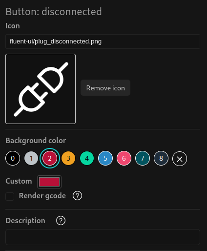
You can click the current icon in this view to open the icon selector, which will display all of the available icons.
You can add your own custom icons to the cncjs-pendant-streamdeck/icons/custom folder, however these will not be
displayed in the icon list, and must be entered in the icon field manually (ex: custom/my-custom-icon.png)
The button background color can either use a color from your configured palette (in the main settings dialog), a custom color, or no color.
The description field is used to display text when hovering over the button (using the html title attribute). It has
no effect on a physical stream deck.
Dimensions
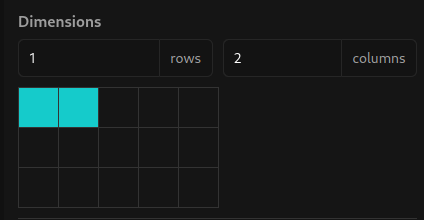
A button can span multiple rows and columns, which can be helpful for making large, prominent buttons, or for visual grouping. In the web view, the button will be displayed as a single large button, with its icon centered. On a stream deck, this large button will cover multiple physical buttons, but will still have its icon centered between them.
Text settings
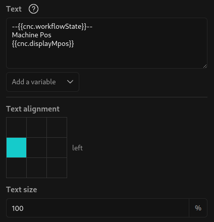
Optionally, a button can display text inside. This is usually used without an icon, or with images with a small and a lot of empty space, to leave room for the text itself.
Text can be aligned in the center of the buttons, or offset/aligned to the outside edges. The Text size option allows
an individual button to display its text larger or smaller as needed. For the global text size and font, see the main
settings dialog.
The text itself can be static text of your choosing, or can include variable values wrapped in curly braces (ex:
{{ cnc.connected }}). For a more detailed look at these variables, see: Variables.
Display conditions
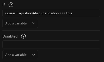
The If field controls a button’s visibility, so that it can be hidden when it’s not relevant, allowing
buttons in the same space to appear instead.
This is typically done by comparing a variable to a known value, using a limited set of javascript. If the value of the field returns true (or truthy), the button will be hidden.
The default “Disconnected” button uses an if condition of: !cnc.connected, and will appear whenever communication
cannot be established between the pendant and cncjs.
The “Alarm” button uses cnc.alarm and will appear whenever the cncjs is in an alarm state.
The Disabled settings work the same way, but instead of hiding the button when its condition is true:
- The button’s background color will not be shown
- The button will be slightly transparent
- Clicking the button will not do anything
This is useful for buttons that are not always relevant, but should not disappear.
Actions
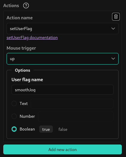
To make a button do something, you can add one or more action behaviors. An action can be triggered based on mouse events (like on press, on release, or on hold). A button can have different actions when held vs when pressed.
In the default configuration, most navigation actions are triggered on mouse release (“up”), while more potentially dangerous actions (like running a macro) are triggered by the “hold” event.
For a detailed list of actions and their available options, see Actions.
Saving
When you’re done editing, you can download your new configuration using the save icon in the upper right corner. After
downloading, replace your current cncjs-pendant-streamdeck config.json with this new one. If using the stream deck service,
you’ll need to restart it for your changes to take effect.